
Edenred Savings App
Unlocking amazing employee savings on iOS and Android.
Background
Edenred is a leading digital platform for services and payments and the everyday companion for people at work, connecting more than 60 million users and 2 million partner merchants in 45 countries via close to 1 million corporate clients.
Edenred Savings is one of their most popular products but the existing web portal was outdated (having been created for web 1.0!) and there was no native app offering. A previous exploration into building a native app was undertaken but fell short of requirements and so I was brought in to look afresh at creating a cross-platform app.
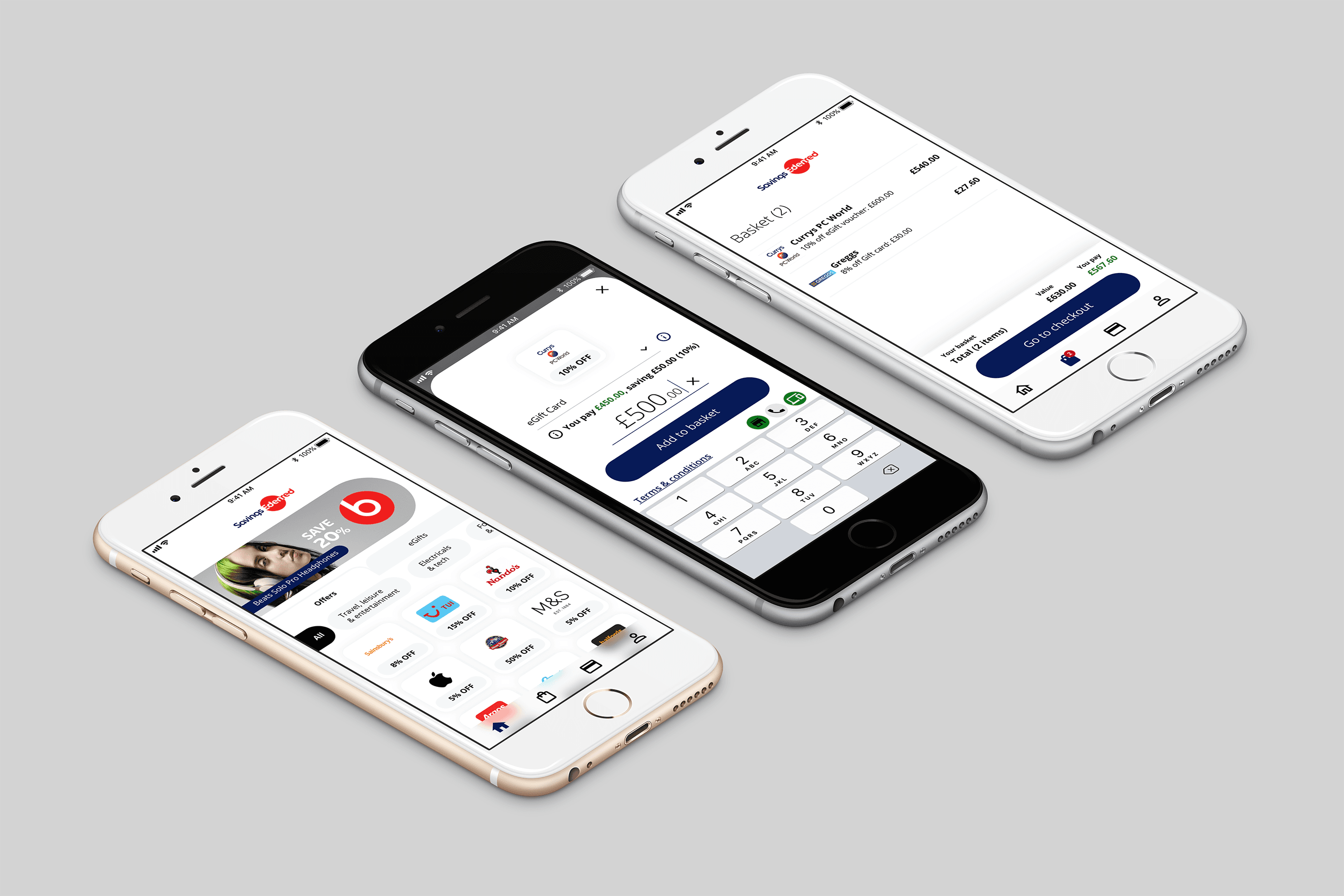
Edenred Savings - Multiple screen views
Objective
To review previous investigation into the app, make recommendations and design an MVP app, to be built on React Native for launch on iOS and Android App Stores. MVP was to be in-market in approximately 3 months.
Design Review
I undertook a review of the original discovery materials and initial designs, and the main recommendations I made can be summarised as such:
Navigation was confusing/ambiguous with no consistency as to how the user moves around the app, exacerbated by poor information architecture
A significant number of retail partners merchandise a wide range of goods categories and both partner and category level creative heavily used combination product shots which resulted in a busy and confusing interface where categories were indistinct from each other, as well as partners
Inconsistencies between UI elements, with nominally identical elements appearing and/or behaving differently in different places
Because the issues were fundamental, it was necessary to essentially start with a clean sheet.
Navigation
To prepare the ground for building the app navigation, it was necessary to bring some structure and rationality to the information architecture.
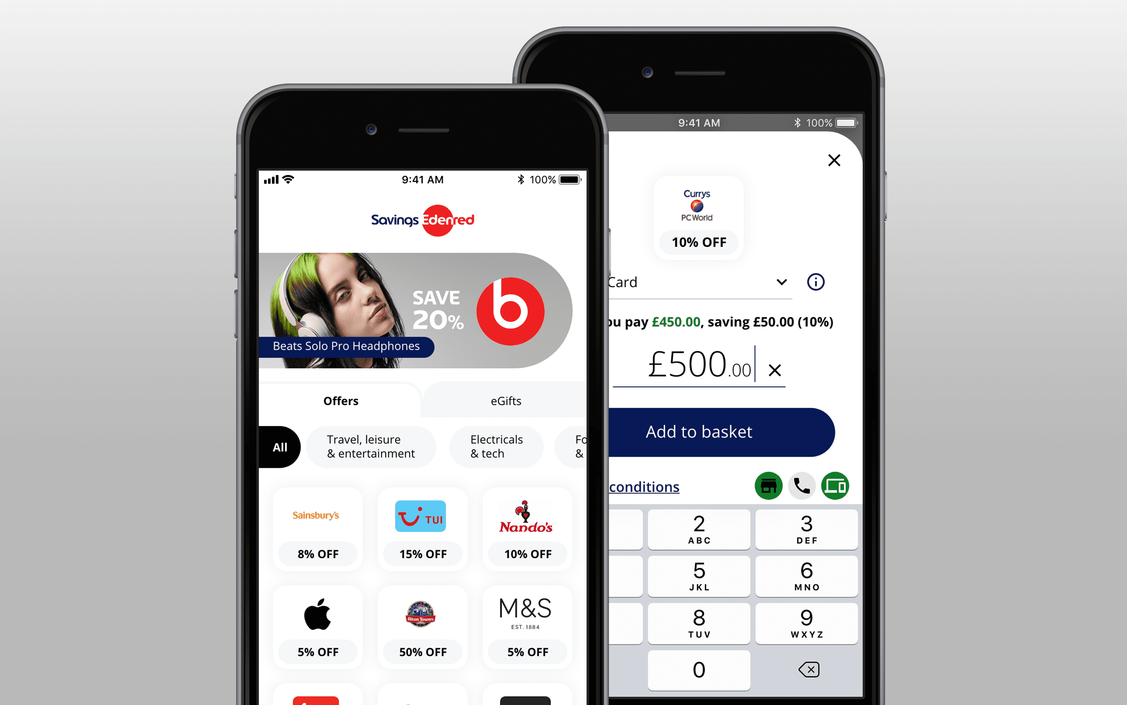
The first move was to actually invert the lowest level of content to be the top level category. Previously, these had been a final selection item when browsing a partner page; users could choose between 'Offers' (discounts on spend) and eGifts (emailed gift cards). These shopping journeys were almost never done in one transaction, made for some confusion in the journey and created a real challenge during checkout due to their different configuration requirements. The result was a large amount of design and development complexity to cater for an edge case. Hence, the top level categories became "Offers" and "eGifts" allowing an optimised journey for each from that point.
I did make some recommendations to simplify the categorisation of partners underneath this top level but due to dependency on the original web portal and time constraint it was decided to leave these categories as-is and push any further changes post-MVP.
That constraint left me with a three-level structure to make as clean and efficient as possible. Experimenting with various stacked and menu type navigation options didn't achieve the results that I was looking for, they were too overbearing and space consuming and 'busy' on screen. I wanted to collapse the navigation to one row if possible and after some further investigation I was able to create an in-line solution where a user could swipe to view the upper level categories, tap to select it, which would then 'pin' that category to the left of the screen and reveal the subcategories, which can then be selected and the content served below. To go back up a level, the user simply 'unpins' the category by tapping the [X] by the label and the upper categories are displayed once again, as demonstrated here:
Edenred Savings - Navigation
Merchandising
The merchandising approach from the earlier design exploration was muddled and confusing, due to the frequent use of composite 'range' images which were intended to express the breadth of products on offer from partner retailers but end up resulting in a morass of indistinct imagery which hobbled the users' ability to identify and navigate to what they were actually looking for.
My hunch was that replacing product images with partner logos would enable users to quickly zero in on what they wanted. Companies spend billions imbuing their brands with meaning to their customers and making sure that they know what to expect when they see their logo and other brand assets. If I'm looking for discounts on my groceries and I'm a Sainsbury's customer, my eye is drawn to their branding, amongst a host of others, first.
Where I would usually lean on unmoderated testing on a platform such as usertesting.com to test such a hypothesis, I didn't have access to an external testing resource so had to make do with guerrilla testing with Edenred staff and my own contacts (fortunately, Edenred customers are numerous and easy to find). Although admittedly a small cohort of testers, their feedback did give confidence that merchandising by logo would improve discovery of partners and offers so I proceeded with that route.
Edenred Savings - Dashboard and Add to Basket
As there was no existing design system (only general brand visual guidelines) to draw from for this project I had to establish a mini DS/Library to define type styles, iconography, buttons and the UI patterns to cover browsing/discovery, basket and checkout interactions, account management and notifications and alerts. Although not an extensive catalogue of elements, it provided a solid foundation for development beyond MVP, enabling I or others to build additional functionality quickly and easily.
Outcome
The MVP app was launched on schedule and I have subsequently been involved in adding additional functionality. The app was then used as the basis for a rebuild of the web portal.
© Dave George Design Ltd. 2023